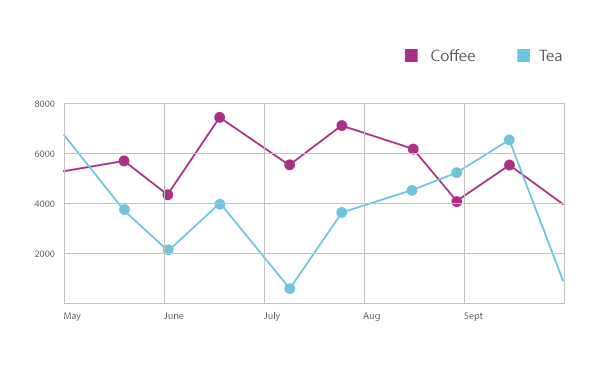
Line graphs are the most popular types of graphs, because they are simple to create and easy to understand. They organize and present data in a clear manner and show relationships between the data. They are used for personal, educational, and professional reasons. Particularly popular in the fields of science and statistics, they can also forecast the results of data that is not yet gathered. While line graphs and bar graphs share the same purpose, line graphs display a change in direction, while bar graphs display a change in magnitude.
Line graphs are used to display the comparison between two variables which are plotted on the horizontal x- and vertical y-axes of a grid. The x-axis usually represents measures of time, while the y-axis usually represents percentage or measures of quantity. Therefore, line graphs are commonly used as time series graphs that show differences in direction. For instance, you can learn about the production of cars in the year 1960 by plotting the time variable (in this case, the months of the year) along the x-axis and the number of cars built in each month along the y-axis. After plotting, you draw a continuous line connecting the points on the grid. The result is a visual representation of the peaks and dips of car production throughout the months of 1960. You can similarly plot the number of cars produced in the years of 1961 and 1962 on the same graph. Thus, you can easily compare multiple relationships.
