Bar graphs are used to present and compare data. There are two main types of bar graphs: horizontal and vertical. They are easy to understand, because they consist of rectangular bars that differ in height or length according to their value or frequency. These types of graphs serve the same purpose as line graphs: they represent time series data. However, bar graphs display a change in magnitude, and not in direction like line graphs.
A horizontal bar graph consists of an x-axis, and a vertical bar graph consists of a y-axis. The numbers on the axes are known as the scales. Each bar is represents a numeric or categorical variable. Vertical bar graphs are best used for the comparison of time series data and frequency distribution. Horizontal bar graphs are particularly useful when category labels are long; vertical bar graphs do not provide much space for text labels.
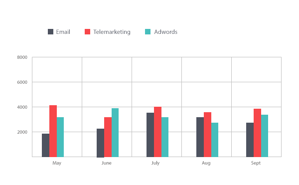
Horizontal and vertical bar graphs may exist in several forms. Double and group bar graphs, whether vertical or horizontal, are used to compare data about the same location or things. These graphs make it possible to compare several features at once. However, they can become puzzling if they contain too many sets of data. While double and group bar graphs are very popular, other types of less popular bar graphs include age pyramid graphs, stacked bar graphs, and dot graphs.