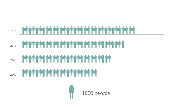
Pictographs, also called pictograms, are diagrams that show and compare data by using picture symbols. Each of these symbols corresponds to a specific quantity and is repeated a number of times. The media often uses pictographs to compare trends; in a magazine, you may see a pictograph comparing the number of nurses in the different counties of Texas. In this case, tiny human figures may represent the nurses, with each figure symbolizing 50 nurses, for instance. Schools use them, as well, in order to train students in mathematics and other subjects in an enjoyable way. Elementary level students often encounter pictographs in their textbooks. These types of graphs are also popularly used by charity organizations to track fund drives. The best example of this is the picture of the thermometer displayed by these organizations. The thermometer represents the total goal amount and its red stripes symbolize the collected donations.
While pictographs are easy to understand, they can be misleading because they provide a general representation. Therefore, they are not commonly used by statisticians and scientists who work with very precise measurements. It is virtually impossible to accurately display the difference between $0.56, $0.61, $11.99 and $12.32 through picture symbols on the same pictograph, for example. Pictographs would be unreliable for this purpose. Sometimes the media takes advantage of the potential unreliability of pictographs and intentionally use them to exaggerate or downplay specific data, in order to influence public opinion on an issue.