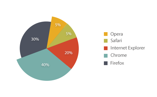
Pie charts are easy to make, easy to read, and very popular. They are used to represent categorical data or values of variables. They are basically circles that are divided into segments or categories which reflect the proportion of the variables in relation to the whole. Percentages are used to compare the segments, with the whole being equal to 100%.
To make a pie chart, draw a circle with a protractor. Then, convert the measures of the variables into percentages, and divide the circle accordingly. It is best to order the segments clockwise from biggest to smallest, so that the pie chart looks neat and the variable are easy to compare. It is also recommended to write percentage and category labels next to each segment, so that users are not required to refer to the legend each time they want to identify a segment.
Pie charts are popular types of graphs, but they do have disadvantages that limit their use. For this reason, scientists are not fans of pie charts. First of all, pie charts with too many segments look very messy and are difficult to understand; therefore it is best to use pie charts when there are less than five categories to be compared. Further, if the values of the categories are very close, the pie chart would be difficult to decipher because the segments would be too close in size. Variations of pie charts include the polar area diagrams and cosmographs.